5 Techniques For Typography & Text Layouts
Typography is a crucial element of design communication, yet it is often overlooked or left as an afterthought by many beginners. However, mastering the art of typography can significantly enhance the overall impact and legibility of your designs. In this comprehensive blog post, we’ll explore 5 techniques for typography & text layouts.
Table of Contents
- Seek Inspiration from Similar Compositions: 5 Techniques for typography & text layouts
- Choose the Right Typeface Hierarchy
- Utilize Typographic Techniques: Stacking, Framing, and Overlapping
- Understand Font Characteristics and Their Practical Applications
- Avoid Leaving Typography as an Afterthought
- FAQ
1) Seek Inspiration from Similar Compositions: 5 Techniques for typography & text layouts.

The first step in improving your typography is to look for inspiration from projects that have similar compositions to what you’re designing. While this may seem like an obvious tip, many beginners tend to neglect this crucial step. By examining projects that resonate with your design goals, you can gain valuable insights into how typography has been effectively utilized in similar contexts.
One great resource for finding inspiration is Pinterest. When you come across a project you admire, be sure to explore the related designs below it. This can help you identify patterns and techniques that you can apply to your own work. Remember, typography is not just about choosing the right font; it’s about understanding how to arrange and hierarchy the text elements to create a cohesive and visually appealing layout.
2) Choose the Right Typeface Hierarchy in 5 Techniques For Typography & Text Layouts
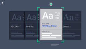
Selecting the appropriate typefaces for your project is crucial for establishing a clear hierarchy and enhancing readability. It’s important to understand the differences between various font classifications, such as sans-serif, serif, display, and monospace fonts, and how they can be used effectively.
Generally, sans-serif fonts work well as heading or primary fonts, as they tend to be more bold and attention-grabbing. Monospace fonts, on the other hand, are often used for secondary or tertiary information, as they can provide a more subtle and supporting role in the overall layout.
When combining typefaces, it’s essential to avoid clashing styles that can make the text difficult to read. Instead, look for complementary typefaces that work harmoniously together, creating a clear visual hierarchy and guiding the reader’s eye through the content.
3) Utilize Typographic Techniques: Stacking, Framing, and Overlapping

Beyond font selection, there are several typographic techniques you can employ to enhance the visual interest and legibility of your text layouts. These include:
- Stacking: Splitting a word or phrase across multiple lines can create a more dynamic and cinematic composition, while also allowing you to incorporate supporting information below the primary text.
- Framing: Enclosing text within a shape, such as a rectangle or square, can help to contain and organize information, preventing the overall layout from appearing cluttered.
- Overlapping: Layering a secondary font or text element on top of the primary heading can add a unique “type texture” to your design, adding visual interest without compromising legibility.
Experiment with these techniques and find the right balance between creativity and readability to elevate your typography game.
4) Understand Font Characteristics and Their Practical Applications
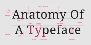
In addition to the basic font classifications, it’s important to be aware of the specific characteristics and practical applications of different typefaces. For example, some fonts may have a standard height or weight, while others may be compressed or stretched, offering unique visual properties that can be leveraged in your designs.
Understanding these font characteristics can help you make more informed decisions when selecting the right typefaces for your project. By considering factors such as character width, height, and weight, you can create a harmonious and visually striking text layout that effectively communicates your message.
5) Avoid Leaving Typography as an Afterthought in 5 Techniques For Typography & Text Layouts
One of the most common mistakes made by beginners is leaving typography as the last step in their design process. Instead, it’s crucial to prioritize typography and integrate it into the early stages of your design development. By considering the typographic elements from the start, you can ensure that the text seamlessly aligns with the overall visual aesthetic and enhances the overall user experience.
Remember, typography is not just about adding text to your design; it’s about creating a cohesive and engaging visual language that guides the reader through your content. Avoid relying on fancy text effects or layer styles to compensate for poor font choices or layout decisions. Instead, focus on selecting the right typefaces and utilizing the techniques discussed in this blog post to create a visually captivating and easily readable design.
CONCLUSION:
By mastering these five techniques for better typography and text layouts, you’ll be well on your way to creating designs that captivate your audience and effectively communicate your message. Remember, typography is not just an aesthetic choice; it’s a crucial element of design that can make or break the overall user experience. Embrace the power of typography and let it elevate your designs to new heights.
FAQ: 5 Techniques For Typography & Text Layouts
What is the difference between a typeface and a font?
A typeface is a collection of fonts, while a font is a specific weight, style, or size of a typeface. For example, Arial is a typeface, and Arial Bold is a font within the Arial typeface.
How can I find high-quality fonts for my designs?
There are many resources available for finding high-quality fonts, such as font marketplaces like Envato Elements, Adobe Fonts, or Google Fonts. You can also follow designers and typographers on social media platforms like Twitter, as they often share their font recommendations and discoveries.
What are some common font classifications, and how do they differ?
Some common font classifications include:
- Sans-serif: fonts without decorative strokes at the ends of characters, often used for headings or primary text.
- Serif: fonts with decorative strokes at the ends of characters, often used for body text.
- Display: fonts designed for larger sizes and headlines, often with more decorative or expressive features.
- Monospace: fonts where each character takes up the same amount of horizontal space, often used for coding or technical applications.
How can I ensure my typography remains legible and accessible?
To ensure your typography remains legible and accessible, consider the following:
- Use a suitable contrast ratio between the text color and background color.
- Maintain appropriate line spacing (leading) and character spacing (kerning).
- Avoid using too many different typefaces or styles in a single design.
- Ensure the text size is large enough for the intended viewing distance and device.
- Consider accessibility guidelines, such as providing alternative text for images with text.
What are some common mistakes to avoid when working with typography?
Some common mistakes to avoid when working with typography include:
- Leaving typography as an afterthought in the design process.
- Choosing incompatible typefaces that clash or create a cluttered appearance.
- Overusing text effects or layer styles to compensate for poor font choices.
- Failing to establish a clear visual hierarchy and typographic structure.
- Neglecting to consider readability and accessibility in your typography decisions.
Follow https://www.digitalpluto.co.in/ for the latest updates about graphic design.