Brand New graphic design trends

The world of graphic design and advertising is changing quickly, and companies are always updating their visual identities to remain current. Businesses are keen to participate in this revolutionary change, from updating their logos to implementing new color schemes and design systems. This post will examine a number of innovative brand new graphic design trends that are expected to rule the market in 2025 and beyond.
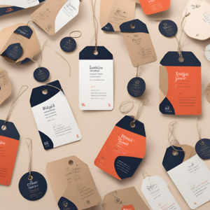
Product Tag Design

Product tag design is among the first design strategies we will discuss. We are greatly impacted by the fashions and goods that influencers, celebrities, and other trend-setters utilize in today’s social media-driven society. In the digital age, this tendency has simply gotten worse in brand new graphic design trends.
Communicating a message or advertising a product to your audience is the main goal of graphic design. However, astute consumers no longer respond favorably to the conventional “in-your-face” advertising strategy. From a distance, they can detect a sales pitch. The new tactic is to make designs that naturally entice the buyer, giving them the impression that they are finding your goods on their own.
Let’s say you have a fashion brand called “Munk” and you want to showcase one of your orange-colored sweatshirts. You could simply post an image of the product, but that would feel like a direct advertisement. Instead, try incorporating a subtle product tag design element.
- First, add a small product tag icon in a color that matches your brand.
- Next, include the name of the product: “Orange Plain Sweatshirt.”.
- Add the price.
- Include a “Shop Now” button to drive e-commerce conversions.
- Finish by displaying the available sizes.
This design looks far less like a conventional ad and seems far more natural. Although you are not actively trying to pitch them on the goods, the buyer will naturally recognize that it is being displayed. This is based on the mentality that the buyer is choosing to buy from you, not you selling. Given that audiences today are very aware of overt sales practices, this subtle change in perspective is essential.
In terms of complexity, the product tag design concept can be taken to different extremes. Finding the ideal balance between giving the buyer enough information to spark their curiosity and not overpowering them with a hard pitch is crucial. Keep in mind that the objective is to provide the impression that the buyer is finding your product naturally rather than being the target of a sales pitch.
Candid Design

We will look into candid design as our next design idea. In contrast to planned or artificial, “candid” describes something that is open, honest, and natural. Unposed, impromptu moments are captured in candid photos. A candid conversation is one in which participants speak freely and without following a script.
In graphic design as well, the concept of authenticity and lack of pretension is becoming more and more significant. Today’s audiences are extremely suspicious of anything that seems too polished or manufactured, especially the younger ones. They prefer to interact with brands that seem real and approachable.
This is accomplished by using design components with a more organic, handcrafted look in candid design. This could involve the use of rough, textured backgrounds, organic icons and drawings, or handwritten typefaces. There should be an air of spontaneity and loose planning throughout.
Assume you wish to use a frank design approach to market your workshop, “Beyond the Box.” Start by selecting an unposed, genuine, and candid photo, such a picture of the actual workshop with people working in the backdrop. Next, add design components that complement this style:
Use a handwritten font for the workshop name, “Beyond the Box.”.
- Employ organic, hand-drawn icons and scribbles as decorative elements.
- Avoid overly clean, geometric layouts in favor of a more casual, asymmetric composition.
The end result should feel much more candid and relatable than a highly polished, designed promotional piece. Audiences today respond better to designs that feel genuine and unforced, rather than overly curated or manipulated.
UI Card Style Design

The card-type layouts that we have observed in user interface (UI) design—what I refer to as the UI card style design—are strongly associated with our next design concept.
Users spend a large amount of time connecting with many digital platforms and services in today’s app-centric society. They have therefore become accustomed to the simple, modular user interface designs seen in a lot of well-known websites and apps.
The card layout is one of the main UI components that has become widely used. Cards offer a self-contained, independent information unit that is simple for the user to scan and process. Users may easily process content without becoming overwhelmed because they feel intuitive and familiar.
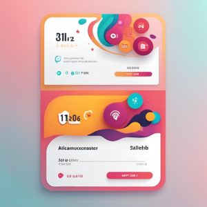
Graphic designers can leverage this UI card style to create visually striking and user-friendly designs. Let’s say you have a logo for an investment company called “Avé” and you want to promote their services with a banner ad. You could design it in a card-style format:
- Use the rounded corners and clean layout typical of UI card designs.
- Include the Avé logo prominently at the top.
- Add a simple, attention-grabbing headline: “Spend Time with What Matters”.
However, by including a notification element, which gives the design an additional level of engagement and energy, we can go one step further. Imagine a tiny icon or notification bar showing up inside the card, maybe showing the Avé investment platform’s current earnings or return rate. This not only captures the user’s interest but also communicates pertinent information and real-time changes.
Staying Ahead of the Curve
In brand new graphic design trends, staying ahead of the curve and evolving constantly are essential. With new trends, methods, and technology appearing on a regular basis, the advertising and design scene is always changing. You run the risk of becoming obsolete and falling behind your rivals if you do not refresh your knowledge and modify your strategy.
Consider it this way: it would be an issue if you had 10,000 clients a month ago and now you only have 5,000. You may have 2,000 clients the following month and then only 200 the month after that. This is because you failed to adapt to the shifting market, not because the work stopped. Customers will begin searching elsewhere for designers who can provide them with the modern, fresh looks they desire.
By investing in your own professional development, you’ll be able to offer your clients cutting-edge design solutions that keep them ahead of the competition. Don’t get left behind; embrace the changes happening in the industry and position yourself as a true leader in graphic design.
Follow https://www.digitalpluto.co.in/ for more latest updates about graphic design.


